
If there’s one aesthetic that knows how to have fun while glossing over reality (quite literally), it’s Frutiger Aero.
Think back to a time when desktop icons resembled real-world items, touchscreens were futuristic, and everything had an electric sheen.
If you weren’t emotionally scarred by Windows Vista, you might even call it “the good old days.”
So, What Exactly Is Frutiger Aero?
@harvey_miller_ Design niches you forgot you knew about #designtok #nostalgia #asthetic #graphicdesign ♬ aquatic ambience – Scizzie
Frutiger Aero, or Web 2.0 Gloss, is the retrofuturistic vibe that your old Windows screensavers channelled—you know, the electric green fields, impossibly blue skies, and inexplicably shiny tropical fish.
It’s a maximalist aesthetic, the visual equivalent of wrapping optimism in plastic, and it lived its prime from around 2004 to 2013 before being overshadowed by a minimalistic flat-design craze.
Frutiger Aero was defined by its glossy textures, vibrant colours, and a mix of natural and technological motifs, including bokeh effects, lens flares, and skeuomorphic design elements that mimicked real-world objects.
Shiny globules, green fields, and tropical fish were staples of the aesthetic, which sought to convey a sense of approachable technology and a hopeful future.
As Sofi Lee, the person who coined the term, put it, Frutiger Aero was about making interfaces look more naturalistic and accessible.
Origins and Rise to Fame
Coined in 2017 by Sofi Lee of the Consumer Aesthetics Research Institute (CARI), Frutiger Aero draws inspiration from two sources: Adrian Frutiger, the Swiss type designer, and Windows Aero, a visual theme that Microsoft embraced in its Vista and Windows 7 operating systems.
Its bright colours, skeuomorphism, bokeh effects, and lens flares all signalled technological optimism—a world where progress coexists with nature, glass, and bubbles. Some might even call it naïve. Others? Refreshingly hopeful.
The rise of Frutiger Aero coincided with a burgeoning tech scene where companies like Apple and Microsoft wanted their products to feel accessible, friendly, even playful.
Imagine skeuomorphic icons that mimicked real-life objects—not because we needed that, but because they seemed approachable.
And if there’s one thing the aesthetic was, it’s approachable—think dolphins jumping out of aquariums, Wi-Fi icons blooming like flowers, and buttons that looked good enough to pop.
Frutiger Aero’s visuals were everywhere, from early iPhones to video games like The Sims 3 and Fruit Ninja, where shimmery graphics and bright colours were used to draw people in.
This was a time when new technologies, such as touchscreens, were emerging, and the design choices were meant to help users feel comfortable interacting with them.
As Evan Collins, another member of CARI, notes, the glossy, jelly-like interfaces made technology feel less intimidating and more playful.
The Fall and Resurgence
Check out The 2000’s Aesthetic That You Definitely Recognise | Frutiger Aero for a great visual breakdown of this aesthetic.
It wouldn’t be the early 2010s without a pendulum swing. Around 2013, skeuomorphism got kicked to the curb by sleek, ultra-minimalist styles like “Flat Design” and “Corporate Memphis.”
The Wii U tried to keep the torch burning, but commercially, it was a flop. Cue the entry of iOS 7—clean, flat, and putting a distinct “we’re grown-ups now” distance from the bubbly optimism of Frutiger Aero.
Yet, in classic fashion, nostalgia brought it back. Starting around 2022, TikTok started buzzing with #FrutigerAero posts—videos that showcased retro Motorola flip-phones, glossy buttons, and surreal collages of swimming pools and tropical skies.
TikTokers leaned into the aesthetic, drawn to its sense of naive hope in a time of climate crises and tech anxiety.
It’s the antithesis to the sterile digital present: glossy, colourful, and perhaps—just perhaps—the future we were once promised.
Slideshows of Frutiger Aero set to soothing electronic music became popular, and the aesthetic also found a home on Reddit, where the r/FrutigerAero subreddit saw a 400% growth in members.
On YouTube, creators began analysing the aesthetic, breaking down what made it so iconic and why it resonated with today’s audience.
This resurgence is partly driven by a collective desire to escape the bleakness of the current digital landscape, replacing it with something more vibrant, playful, and hopeful.
The resurgence of Frutiger Aero also mirrors the broader nostalgia movement seen in digital culture.
Much like Frutiger Aero, other nostalgic aesthetics are making a comeback as people seek comfort in the past.
Take MapleStory, for example—a massively multiplayer online game that many players are returning to for its wholesome escapism and social elements.
MapleStory, like Frutiger Aero, represents a utopic escape from the complexities of modern life.
Its pixelated graphics, community-based gameplay, and open-world adventure evoke a simpler time when digital experiences were about exploration and connection rather than relentless commercialisation.
This shared sense of nostalgia, rooted in a desire for simpler and more optimistic digital worlds, fuels the renewed interest in Frutiger Aero.
Subgenres and Where You See It Today
Frutiger Aero didn’t just stay in its lane; it branched into sub-aesthetics like Helvetica Aqua Aero (think underwater vibes mixed with glossy Y2K), Frutiger Eco (nature-centric and kind of like Solarpunk’s chill cousin), and Dark Aero (a sleeker, high-end variation).
These subgenres reflected different aspects of mid-2000s visual culture, from the playful optimism of bright colours to the more serious, subdued designs used in enterprise products.
The Frutiger Eco subgenre focused on environmental themes and an optimistic, eco-friendly future.
Amanda Brennan, an internet culture expert, believes this nature-centric aspect of Frutiger Aero is one reason for its revival today, as more people become eco-conscious and yearn for a balance between technology and nature.
It’s why the aesthetic often merges imagery of the outdoors with technology, creating a sense of the natural and digital worlds coexisting harmoniously.
Interestingly, Frutiger Aero is also making waves in the world of branding and fashion.
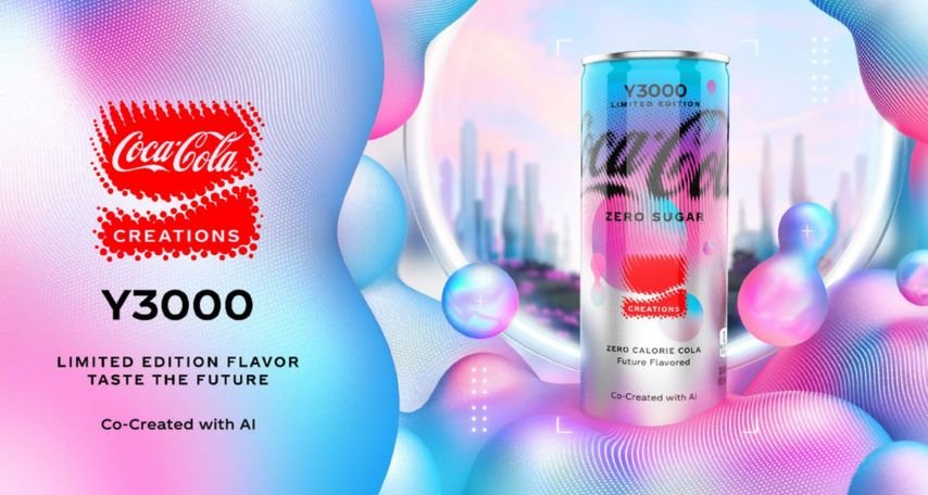
Brands like Coca-Cola have recently dabbled in Frutiger Aero—take their Y3000 can, for instance, with its clean, blue, and pink aesthetic reminiscent of nature, just with a bit more gloss.
This isn’t just branding; it’s selling nostalgia for a simpler, hopeful time, something both younger audiences and the older generation are latching onto.
Why Is It Popular Again?
You could say it’s all about timing. Frutiger Aero is comforting; it’s an aesthetic that bridges the gap between today’s worries and the optimistic promise of a glossy, tech-driven future that never quite arrived.
It’s humanism rendered in vivid colours—a sense of warmth that contrasts sharply against today’s algorithmic, sterile interfaces.
The revival is happening because, let’s face it, people are craving something that feels a little less like the Matrix and a little more like Wii Sports.
In essence, Frutiger Aero is back because we need it to be. It’s a throwback to when technology was filled with hopeful promise, not anxiety-inducing doomscrolling.
It’s a reminder of simpler times—not perfect, but less complicated, where even your desktop background wanted you to feel optimistic.
As Amanda Brennan put it, “There’s a lot of hopefulness in this aesthetic that Y2K doesn’t have.”
It’s this hopefulness, combined with a desire to shake off the last few years, that makes Frutiger Aero resonate so deeply today.
MapleStory, too, serves as an example of this broader nostalgia trend.
The game is remembered fondly for its sense of community, with players gathering in town squares or joining party quests, much like how people nostalgically remember the early days of Frutiger Aero.
Both evoke a longing for digital spaces that felt friendly and hopeful, a stark contrast to today’s hyper-commercialised and often isolating online environments.
The Future of Frutiger Aero
Is Frutiger Aero here to stay? Well, if the “20-year nostalgia cycle” has anything to say about it, we’re in for a ride.
The aesthetic might find itself more as a recurring motif rather than a sustained trend—but who’s to say?
In a world increasingly dominated by flat design and corporate visuals, Frutiger Aero offers an escape: a cross-generational high-five to a future that could still be bright, bubbly, and optimistic.
Frutiger Aero is a reminder of a time before the dominance of minimalism, a bridge between a hopeful tech-driven future and the realities of today.
As nostalgia continues to influence cultural trends, this aesthetic might just keep bouncing back, a glossy beacon of what could have been—and what still could be.


